
Windows
Windows
We’re excited to announce the public release of our feature showcase sample app, Van Arsdel!
The Van Arsdel, Ltd. end-to-end UWP sample app makes extensive use of the improved density and new controls in the Windows UI Library as well as powerful underlying features of the UX framework and composition.
This complete sample demonstrates the features in the 1809 SDK and is built on top of WinUI 2.0, giving you a full immersive example of how to build a rich, productive experience (in this case, selling lamps).
The app is and its source can be downloaded on .
Spotlight Features
Van Arsdel uses many new and exciting features that were launched in the latest release, some of which include controls that were requested from our community.
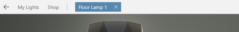
Horizontal Navigation View
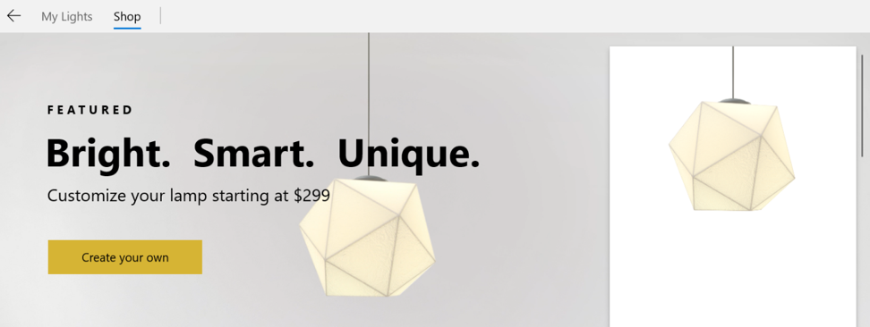
The sample app sports a sleek horizontal NavigationView with an in-line back button and Pivot-like visuals while maintaining a compact and CommandBar-like feel.
This particular NavigationView has also been modified to add “tabs” of new lamps when you click “Create your own” on the shop page:
If you’re curious about how to develop a similar experience for your app, please for the source on how we did this!
Compact UI Density
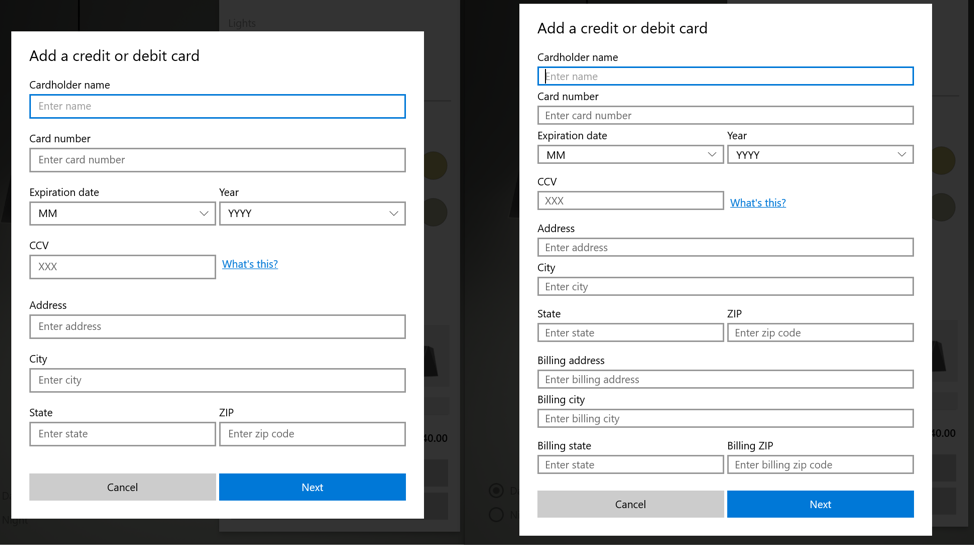
XAML has also become more compact in the latest release! Van Arsdel sports two, more compact versions of our controls.
One version is our new standard sizing and the other is our new Compact Density sizing. Both can be viewed on the “Create your own” lamp page when you click the “Buy” button. Shift-clicking that same button will reveal the Compact Density mode (seen above on the right).
Command Bar Flyout
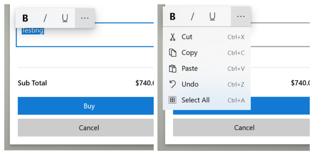
Controls can now be much more robust with the ability to display a new control called CommandBarFlyout! This control works very similarly to our standard CommandBar control – even taking AppBarButtons within it! – but this new control also allows for MenuFlyoutItems to be placed in the overflow menu; in this case, enabling a more complete text input experience.
Learn More
To learn more about these exciting new controls, be sure to check out our .
The post appeared first on .
The Van Arsdel, Ltd. end-to-end UWP sample app makes extensive use of the improved density and new controls in the Windows UI Library as well as powerful underlying features of the UX framework and composition.
This complete sample demonstrates the features in the 1809 SDK and is built on top of WinUI 2.0, giving you a full immersive example of how to build a rich, productive experience (in this case, selling lamps).
The app is and its source can be downloaded on .
Spotlight Features
Van Arsdel uses many new and exciting features that were launched in the latest release, some of which include controls that were requested from our community.
Horizontal Navigation View
The sample app sports a sleek horizontal NavigationView with an in-line back button and Pivot-like visuals while maintaining a compact and CommandBar-like feel.
This particular NavigationView has also been modified to add “tabs” of new lamps when you click “Create your own” on the shop page:
If you’re curious about how to develop a similar experience for your app, please for the source on how we did this!
Compact UI Density
XAML has also become more compact in the latest release! Van Arsdel sports two, more compact versions of our controls.
One version is our new standard sizing and the other is our new Compact Density sizing. Both can be viewed on the “Create your own” lamp page when you click the “Buy” button. Shift-clicking that same button will reveal the Compact Density mode (seen above on the right).
Command Bar Flyout
Controls can now be much more robust with the ability to display a new control called CommandBarFlyout! This control works very similarly to our standard CommandBar control – even taking AppBarButtons within it! – but this new control also allows for MenuFlyoutItems to be placed in the overflow menu; in this case, enabling a more complete text input experience.
Learn More
To learn more about these exciting new controls, be sure to check out our .
The post appeared first on .